Here’s Your First Look at the New Toronto Maple Leafs Logo
In preparation for the club’s Centennial season in 2016/17, the Toronto Maple Leafs just unveiled their new official logo. Except that “new” might not actually be the best term for it.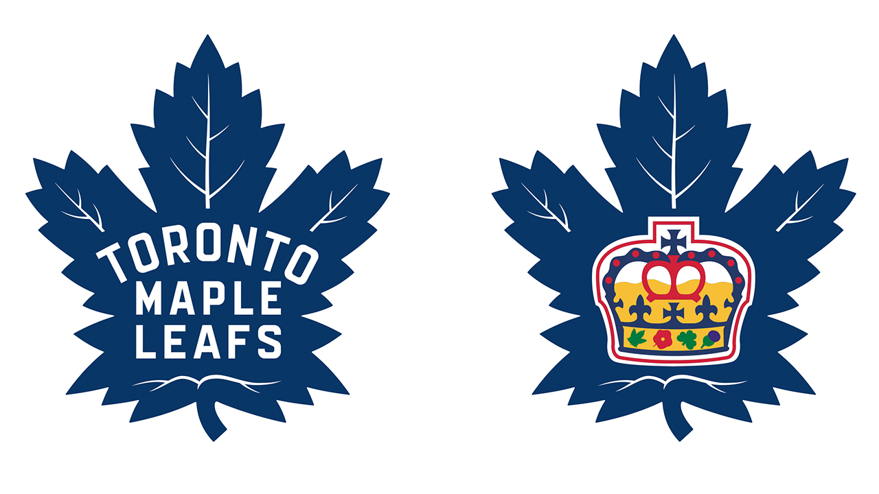
The Buds’ latest crest — shown above with the equally awesome new mark for their farm team, the Toronto Marlies — is a perfectly executed update on the designs the team used between 1939 and 1967. You know, back when the Leafs actually won Cups.
The new badge features 31 points, which is a nod to 1931 — the year that Maple Leaf Gardens first opened its doors. There’s also a total of 17 veins to represent 1917, the year the team was founded, with 13 positioned along the top to commemorate the club’s 13 Stanley Cup Championships.
It’s at once a throwback that honours those legendary squads, and a fresh look to coincide with the complete rebuild that head coach Mike Babcock is currently overseeing. For a franchise that hasn’t done a whole lot right over the last few decades, this is one awfully big win.