
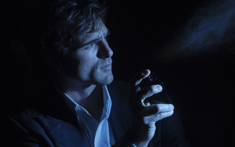
Felipe Pantone, the trendsetting artist from Valencia, Spain, knew that the tattoo on his left forearm was a mistake even before sitting down to have it done. The design, which he got in 2017, features a kneeling lady, naked except for a lightning bolt flashing across her insanely curvaceous body.
“It’s my worst one,” the 33-year-old confesses before noting a design on his right arm that’s much cooler: criss-crossed lines that create a rippling moiré effect. The other ink is a better example of Pantone’s personal aesthetic. It echoes the highly graphic, optically trippy paintings and sculptures that have made him the millennial version of Keith Haring — an artist who started working illegally in the streets before transcending media and blowing up in a big way. Pantone currently has eight studio assistants, a business team of four, over 270,000 Instagram followers, and brand collaborations with major names including Nike, Instagram, and Hennessy — amazing fo someone who started out at age 12 scrappily tagging buildings under an earlier pseudonym “Pant1” (he named himself after the colour company; his real name is a secret, as is his face — his way of focusing all the public attention on his art, not him personally).
But the bad tattoo wasn’t an aesthetic statement. It was a way for Pantone to pay the artistic freedom he enjoys back into the universe. While in Canada two years ago, after launching a solo show in Montreal (one of many, many such international shows he’s mounted recently), he ran into an artist that he admires, Curt Montgomery. “I love his work,” he says. “And my ex-girlfriend told him that I was about to go to Toronto and was thinking of getting a tattoo. So he came up with this naked woman and told me where it should go. I was like, I don’t really like it. But I also thought to myself, when I go places, I like people to let me paint whatever I want.”
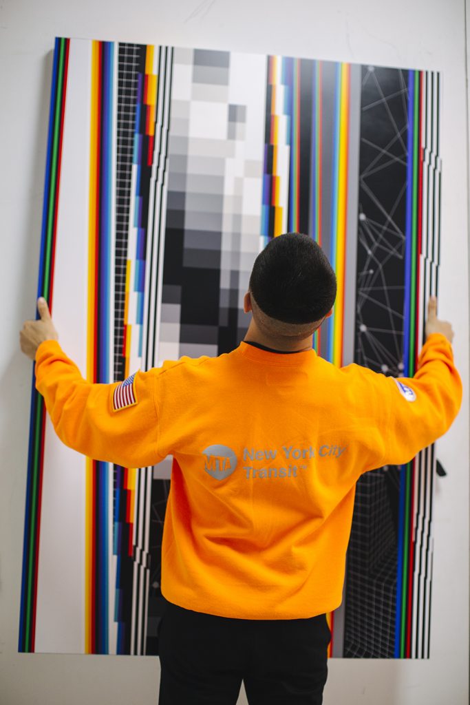
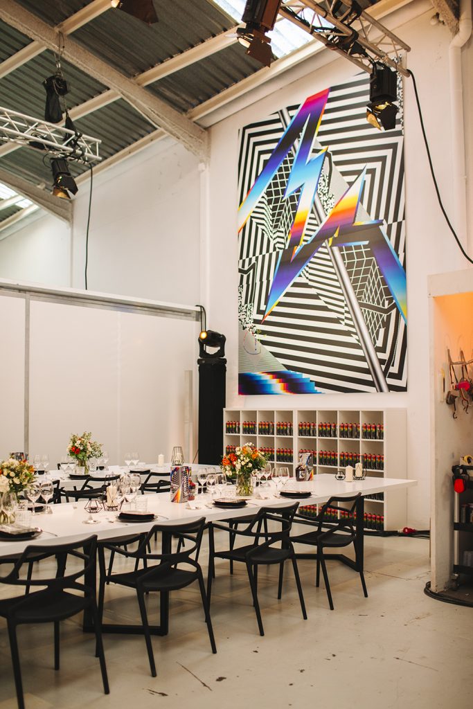
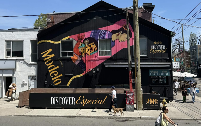
For him, “whatever I want” refers to his singular, idiosyncratic style. A bit like Banksy, his images have a zeitgeisty undertone. They are a comment on how our analog past is being laid to waste by a technologically disruptive, ever uncertain future. They almost always feature warping black and white grids — spinoffs from the trippy optical illusion art of the 1960s (Victor Vasarely is a big inspiration). These patterns are being broken apart by super-saturated bursts of blues, yellows, and reds. Sometimes massive in scale — one of his murals covers the side of a 17-storey building in Portugal, another a concert hall in Buffalo, New York — his pieces tend to look like old TV screens being destroyed by something newer and brighter, if potentially more menacing.
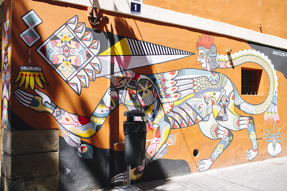
Pantone honed his style on his own, building his artistic cred the long, hard way. Before he had his own studio in Valencia — a bright white, airy loft with a tree-lined courtyard and a bank of silver iMacs — he painted the surrounding Baroque thoroughfares as a teen. In fact, some of his first murals can still be found in the peach-coloured Mediterranean seaport. Which is a huge sign of respect from the city’s many other graffitists, who are so numerous they simply cover over anything but the things they collectively admire most in order to have more wall room for new stuff.
Although Pantone mainly works on commissions these days — building owners court him because they know an original design will immediately spike attention, and therefore real estate values — Pantone wants artistic freedom no matter the job. “As an artist, you have to work by the rules you know,” he says. “I think that’s so important. I didn’t do whatever they told me to do in art school, working with ancient techniques that nobody cares about anymore. I went out and learned my own techniques — the techniques I wanted.”
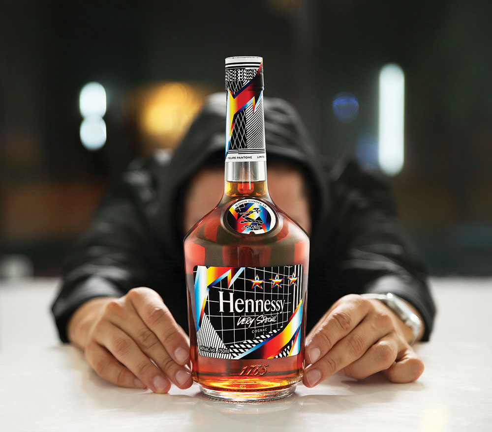
The same sense of individualism applies when he’s working with big corporate clients. He doesn’t bend his vision — he convinces them to bend to it. Literally. Recently, he was asked by Hennessy, the centuries-old cognac brand, to design a limited-edition logo for its Very Special line. The current bottle is attractive but traditional, in use for at least 50 years. Its label features leaves and grapes encircling the classic Hennessy typeface; the backdrop is flat beige.
Pantone’s version looks nothing like that. His signature colour palette — zebra stripes thrown into Timothy Leary’s blender — electrifies the front, with flashes of rainbow overlaid across a black and white grid. Called Remixing the Present, it brings in bits of QR codes, Zaha Hadid–esque angles, and a disorienting collision of patterns.
Yet perhaps what’s most daring about the design is that Hennessy’s typeface, instead of reading straight across, is skewed on an angle, following the lines of one of his grids. The brand has collaborated with other street artists for limited-edition logos, including JonOne and Vhils. But no one else has been so bold as to bend the logo out of its classic state.
“Working with Hennessy is something I never could have imagined,” says Pantone. “But I was like, let’s hear whatever Hennessy has to tell me, and I’ll tell them what I have, and let’s try to get somewhere.”
He likes the brand — “I’m really impressed by their dedication to craft,” he says — and, unlike some artists who balk at corporate clients, he appreciates such big commissions because they allow him to grow his studio and buy new, more expensive equipment. In the past, he’s bought a vinyl cutter that makes sharp-looking stencils, for example, or a high-tech flatbed printer that can transfer images onto just about anything, including wood and metal — tools that allow him to make the exact images he wants to make, and put them exactly where he wants them to be.
