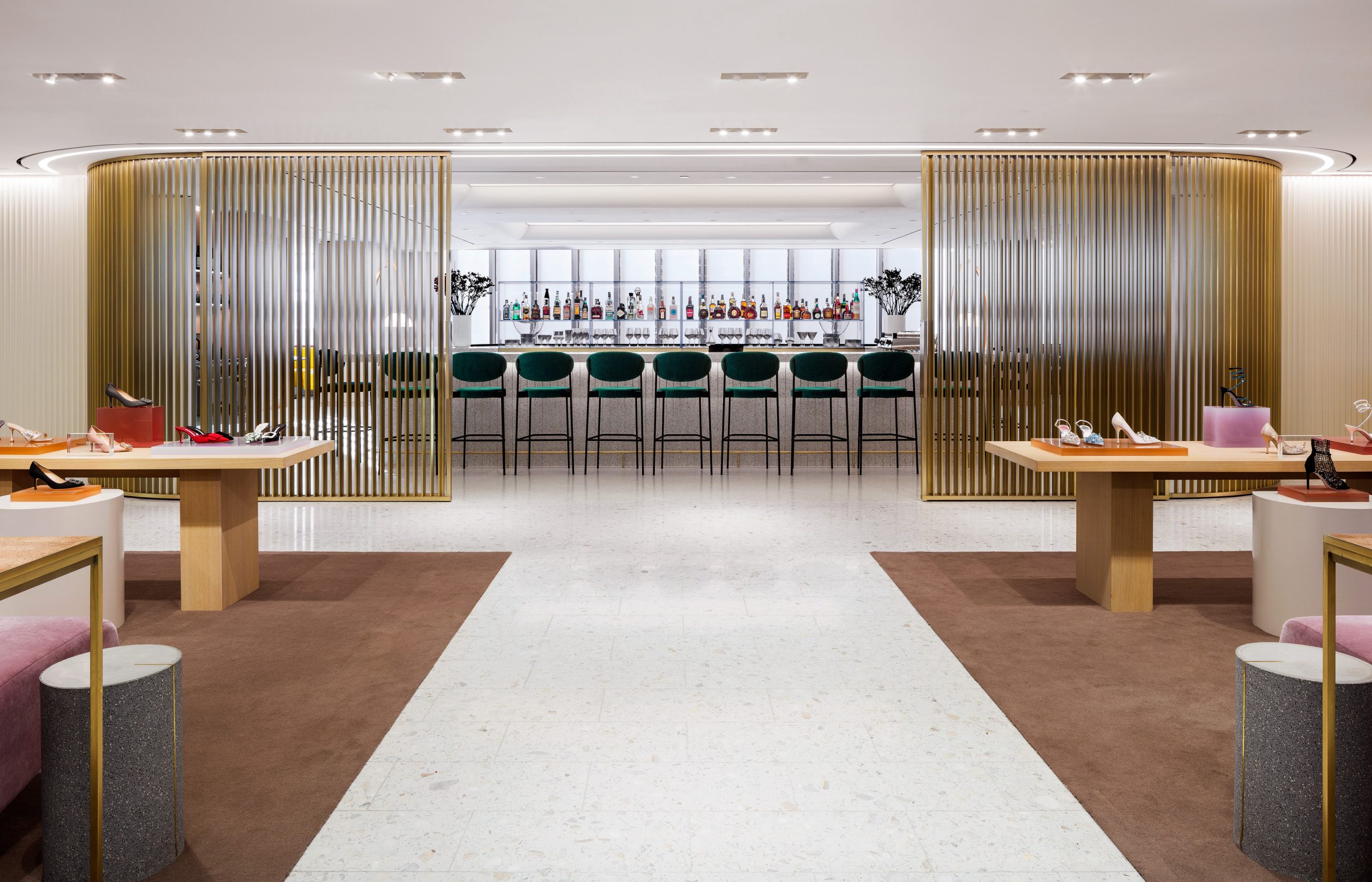
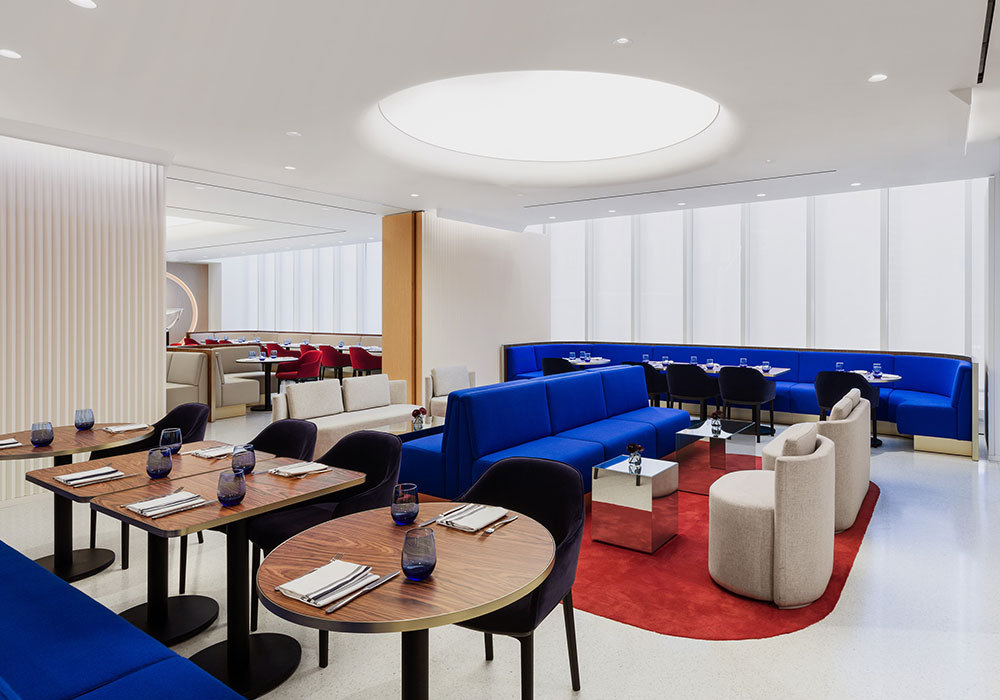
The power lunch may be dead, but Holt’s Café is poised to take its place. Tucked discreetly on the third floor of Holt Renfrew’s Bloor St. flagship, the reopened cafe is airy and colourful, the perfect place to sit on a jewel-toned couch, sip a martini and peer out of the floor-to-ceilings windows at the passersby at street level.
So how do you redesign such an iconic restaurant? Leave it to Alex Cochrane, the architect behind his eponymous London-based firm. For his first project in Canada, Cochrane tapped into his painterly instincts to create a space that’s every bit as stylish and sophisticated as its diners. We caught up with him to talk about his obsession with colour and shape and designing his first-ever restaurant.
This is your first project in Canada. How did it come about?
Our restaurant experience is super limited: we’ve done a café before but never a restaurant. What we’ve done before is quite a lot of retail space, particularly Selfridges [in London, UK], and I suppose what you see here is what we do in retail: we add in colour, we add in shape. I think the vision for us was to have bits of colour, bits of shape for the new café, so they thought maybe we might be appropriate.
What was your vision for Holt’s Café?
We didn’t really have an idea so much about the interior because we were mostly focused on the envelope of the building. They were doing the outside of the building, so they had a design for the windows, which we thought, “Well, let’s try and change that.” So, for the first couple of months it was really not about the café at all, it was about the elevation. The restaurant is also much deeper than it used to be, so what you don’t really want, particularly because we haven’t got massive ceiling heights, is to have this big, flat seating space seating space.
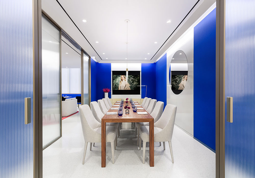
So you have the stretched ceiling going up, just trying to create a bit more three dimensionality in the ceiling to add a bit more height. Then we wanted to, rather than make one, big massive hall, we thought about how to divide it and create little, more intimate rooms. We have an area that could be more loungy in the evening, then right at the end there’s an intimate private dining room lined in wood, so it’s a bit more cozy, and the next room is a bit more open. So [it’s about] creating series of different atmospheres with what we do: using colour but keeping it quite pared down same time. We’re not too decorative.
What was it like designing your first restaurant?
I think the fact that this is a department store floor, we definitely had to think about the transparency with the luxury leatherwear and the shoes. Part of the brief was to try and make a marriage between both: we wanted it a bit punchier and less, you know, off-pink.
What were the key considerations you brought from your past experiences designing retail, office spaces and artists residences?
There’s definitely continuity in what we do. I suppose we’re minimalists, but you almost need the space to actually do perfect minimalism and if you haven’t got the proportions, you sort of do your best. We’re quite mad about fabric, we’re quite mad about colour. We love materials, we love when materials come together. I think all our projects have that element; there’s a familiarity between all of them. However, saying that, it’s quite different when we do someone’s house – we’re really quite pared down. If we’re doing a retail environment you need a bit of drama, you need a bit more blatant.

