Building Character: Ian Greig on Bringing Props to Life
Some people go to the movies to see the famous actors playing equally famous characters, set in ever-expanding cinematic universes. Others will buy a front-row seat to dissect the movie’s symbolism, analyzing the plot like a Film Studies seminar (‘front-row’ is metaphorical, of course, everybody knows you sit in the middle for a good view). However, there’s one aspect of filmmaking that is truly a testament to the medium, unparalleled by plot devices or celebrity glitz: aesthetic.
Think about the sweeping sands on the set of Dune, the mid-century labs of Oppenheimer, or the flashy, animated camp of this year’s Super Mario Bros. These elaborate, world-building illusions blur the lines between the ‘real world’ and behind-the-camera fantasy, spinning a Hollywood narrative from carefully chosen props and paints and plasters. But, as you’ll learn, set decorators on production crews are direct relatives of interior designers — both camps draw from practical design principles, furnishing a space around a character and feeling. Speaking with Ian Greig, a set decorator with a thirty-year-long resume, we got the inside scoop on set decoration, learning how his character-specific curation methods customize a scene and how to prepare one of our own.

Robert Pattinson, Robert Eggers. Photo by Chris Reardon, courtesy of A24.
“I got into this by having carpentry skills, initially,” he said. A brief stint as a builder for various clubs served as Greig’s gateway into the production world. It was an easy enough transition from bar carpentry to set decoration — both roles require a quick work ethic, paired with a keen sense of aesthetics. Early roles ranged from a playful sci-fi set in Nova Scotia, to more construction-based duties — one film asked Greig to work a solitary night shift, spending hours reassembling a boat that was blown apart during each day of production.
The upside of such a varied workplace? A wealth of knowledge and a treasure trove of home décor. Greig has since worked his way up the production chain, and now oversees set décor. For Greig, the process starts with, “A logical discourse about who the character is,” he said, elaborating, “my furnishings are all the details, physical culture that communicate something about the character.”
Somebody’s tastes, preferences, and personal style all contribute to a sense of being — to construct a space, as Greig does, is to construct an identity. This sense of decoration frames style as an extension of personality; think about the furnishing of your kitchen, for example. Quality cast-iron skillets suggest a passion for food, while vintage dining sets might reveal family heritage. Greig’s work is the careful curation of these real-life details, adding depth to aesthetic.
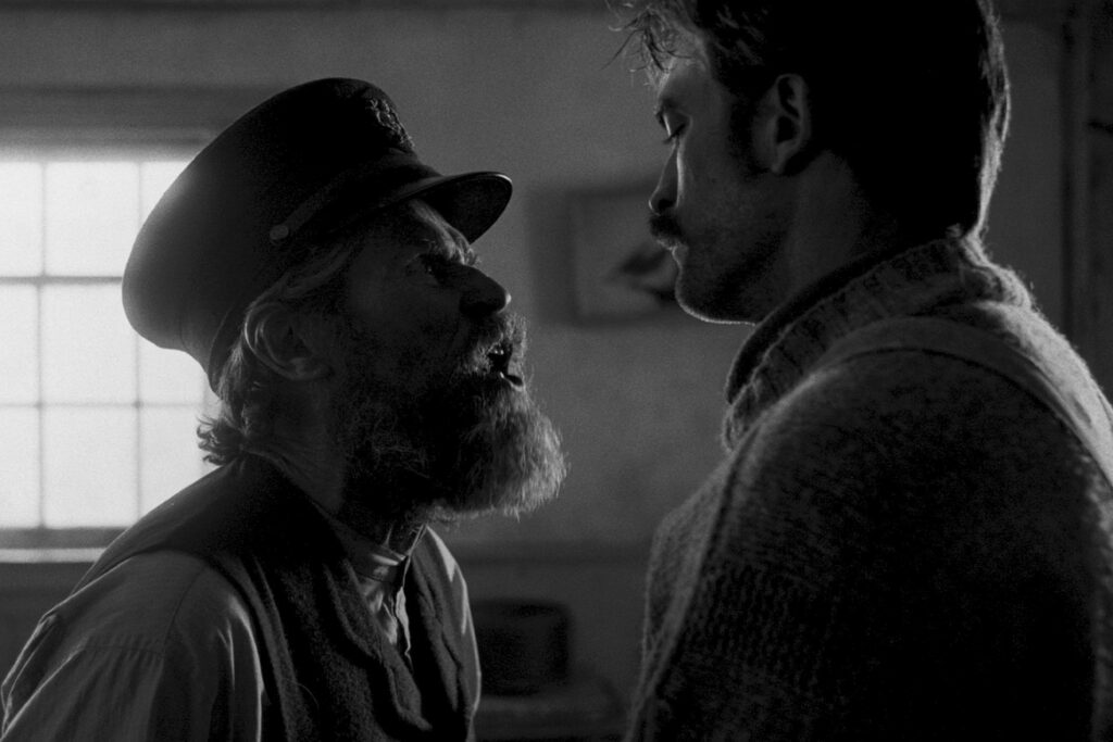
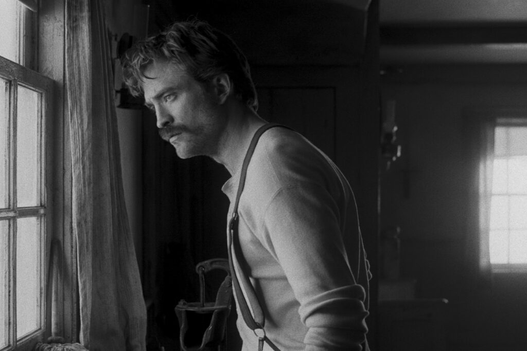
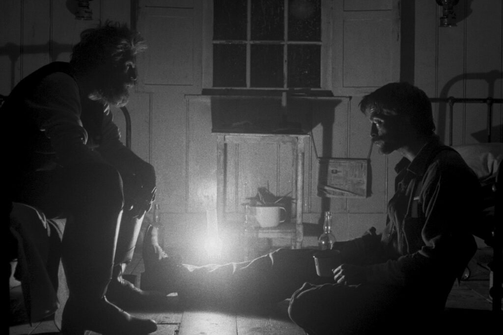
Robert Pattinson, Willem Dafoe. Photos courtesy of A24.
“There are two kinds of actors on screen,” he says, “there are the actors that are the ones that move around and talk and then there are the inanimate [actors].” These latter group has as much of an impact in reality as it does on screen — when Greig decorates, he translates these ‘inanimate actors’ from everyday life onto the film set. “We’re not so much in the business of creating illusions — we deal with real thing, and it’s a great delight to handle,” he says of sourcing the props.
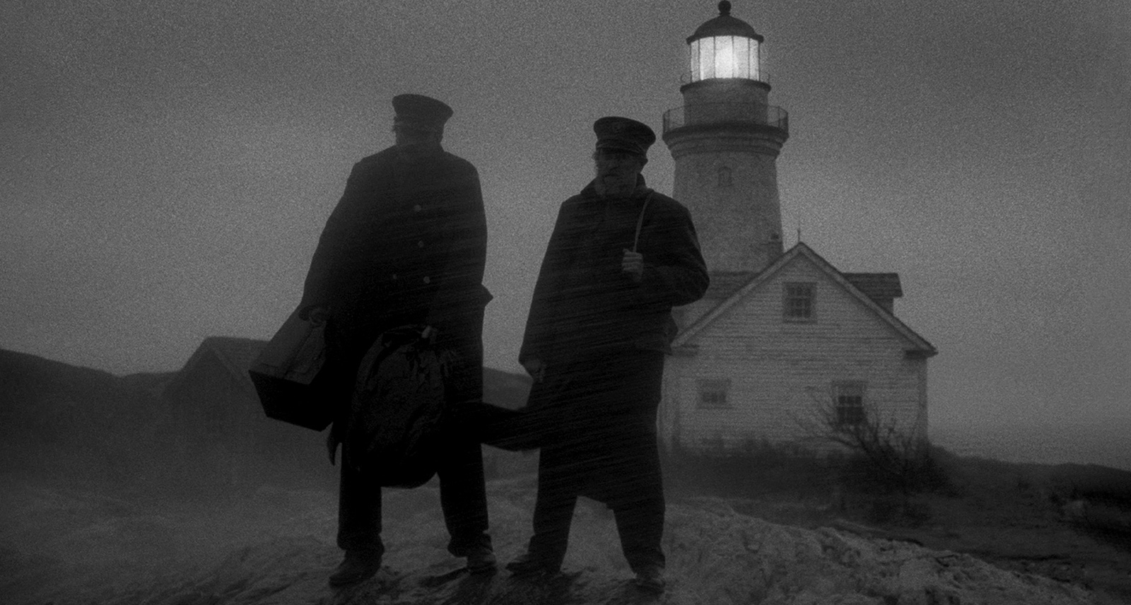
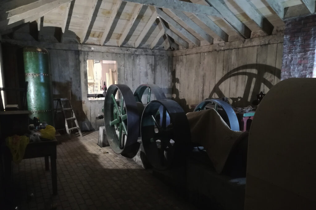
The ‘real thing’ in question varies from set to set: one memorable instance involved outfitting a steam engine room for The Lighthouse. “I started out not knowing a great deal about steam engines really” he admitted. Still, that didn’t deter him — Greig found a steam engine collector, from whom he borrowed an engine for the set. Next, Greig and his team customized the antique parts for the film: “We provided the gauges and handles and whatnot that made the thing look real. The painters painted the fake furnace in a way that was relevant to the real things we provided.”
The result, in case you missed it, was a jarring time capsule: dark shadows sweep down, flickering by the fire light while a man shovels coal into a furnace. The steam compressor takes centre stage, its bulky silhouette escalating the scene’s tension. SHARP cover alum Willem Dafoe co-starred as a windswept wickie, his shock of grey hair enhanced by the retro-industrial surroundings.

Of course, not every set belongs to a world so distinct. Sometimes, the stage is a modern home; a setting that allows for a certain playfulness. Interior aesthetics are often dependent on the character’s home life — their family, roommates, or lack thereof contribute to the style of their space. Viewers can read into the setting, gleaning unspoken aspects of a character’s personality from their décor.
Greig is clear about the intentionality behind his work: “The first question you ask is, what kind of person is living in this space? Are they a person who has hired a decorator or are they a person that’s decorated it themselves?” Decorators answer these questions before deciding which props to use, and where to source them.
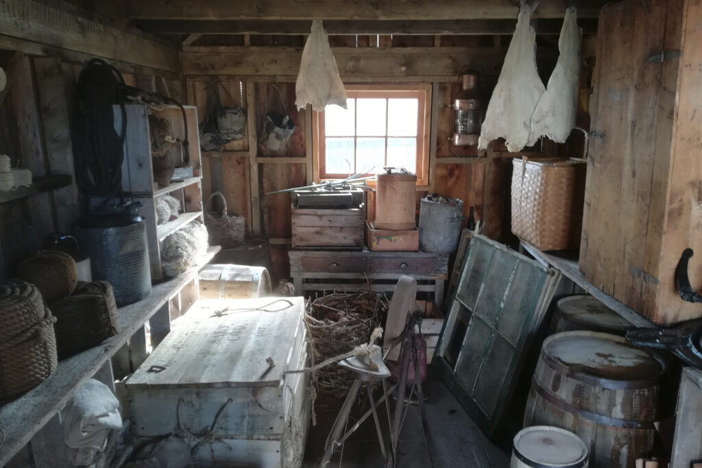

This line of work puts a magnifying glass up against home design trends. “There’s been a lot of times when I’m working on a show, and I have to make a room that looks like they’ve hired a decorator, and the decorator made it look pleasing by whatever the modern standards of the time are,” he noted. “Over my career, what people think is pleasing has changed; trends have come and gone and come again.”
Even the most barebones, no-frills aesthetics speak to the characters they house, “For the people who don’t care — and don’t care to have someone [decorate] for them, either — a lot of the time, that’s exactly what [the set] should say: ‘this person has no interest in beyond going to the closest store and buying the cheapest thing.”’ Washed out settings are filled with nondescript items like fake plants and generic furniture sets, reflecting a character’s disengagement. Meanwhile, bespoke interior palettes have the opposite effect, constructing a character whose tastes can’t hide.
Greig’s own style is “a museum of personal history,” as he calls it. His space is lined with vintage pieces from special sets, acting as “a personal archive.” The principles of interior design are not unlike fashion sense or favourite cuisines — the more you understand your tastes, the better your space can reflect them. Your ‘inanimate actors,’ as Greig calls them, have as much to say as the person who curates them. So, the next time you’re focused on a silver screen, take in the background details — you can learn from what meets the eye.
Featured image: Robert Pattinson, Willem Dafoe. Courtesy of A24.
